
Delivery Card Element
Buy with Prime API is now available for early access
Sign up for early access to the Buy with Prime API using the 'Sign Up' button below. The API may change as Amazon receives feedback and iterates on it.
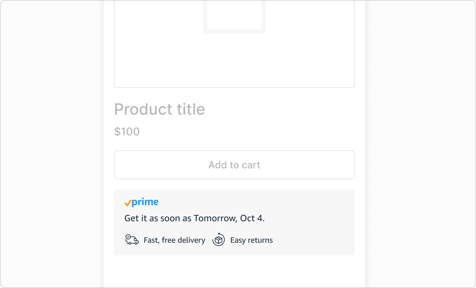
The delivery card element is a web component that displays the Prime checkmark logo, a delivery estimate, free delivery message, and return eligibility. Use the delivery card element on the product detail page to identify products eligible for Buy with Prime, provide shoppers with a delivery estimate, and indicate whether a product is returnable.
- JavaScript source:
https://cdn.elements.amazon/elements/amazon-delivery-card/v1.0/web-component.js. - HTML tag:
<amazon-delivery-card>.
The following image shows a delivery card element on a product detail page.
Attributes on the element tag
The delivery card element requires a product identifier attribute, and it has optional attributes for display settings.
Product identifier
One of the following:
| Attribute | Description |
|---|---|
product-external-id | An identifier from your ecommerce platform. |
product-id | A Buy with Prime generated product ID. |
product-sku | A SKU from your ecommerce platform. |
product-amazon-sku | Amazon SKU on Amazon Seller Central or Supply Chain Portal. |
You can also optionally specify a marketplace by using the product-marketplace-id attribute, which is set to US by default. For a site that doesn't use Shopify, see Handle product variants. For a site that uses Shopify, to support variants, use the following attributes.
| Attribute | Value | Description |
|---|---|---|
provider | "shopify" | Sets the ecommerce service provider. |
variant-helper | "true""false" | Determines whether the element automatically updates when a shopper selects a new variant on a product detail page. The default is "true". |
Appearance
| Attribute | Value | Description | Example |
|---|---|---|---|
show-explainer |
"true" |
Displays the message "Choose Buy with Prime at checkout." The default is "false". |
 |
color-mode |
"light""dark" |
The color mode of the element. The default is "light". |
"dark"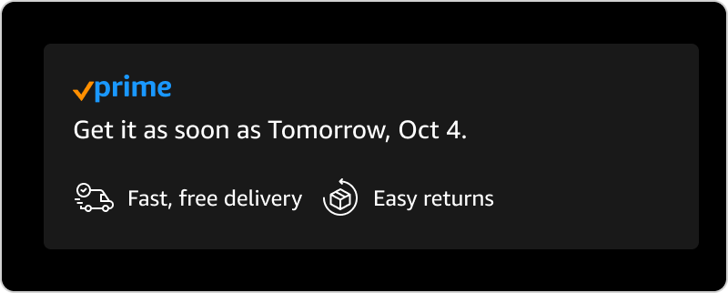 |
background-color |
Hex color code | The background color of the element. | "#FCF6E1"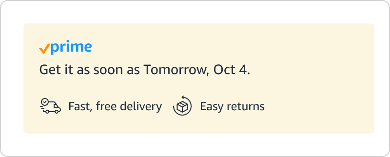 |
text-color |
Hex color code | The text color of the element. | "#B35E14"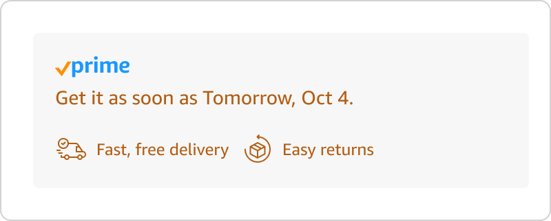 |
font-family |
Name of the font | The font of the element. The default is "Amazon Ember". |
"Times, serif"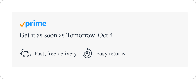 |
font-size-base |
Size in pixels, for example 16px |
The font size of the element. The Prime Check logo increases or decreases in size to match. The default is 14px. |
18px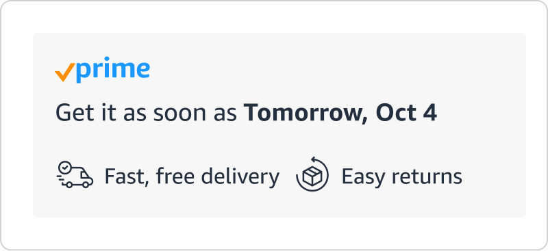 |
corner-style |
"rounded""square" "pill""custom" |
The corner style of the element background. If you choose "custom", you must also set the border-radius attribute. The default is "rounded". |
"pill"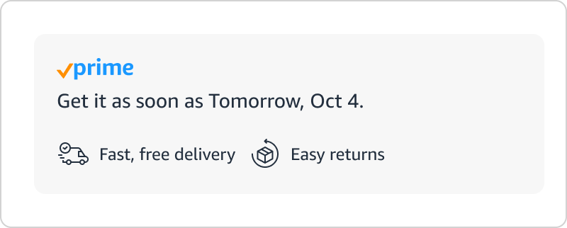 "square" |
border-radius |
Size in pixels, for example 24px |
To set a border radius, you must also set corner-style to custom. |
24px |
Example
<amazon-delivery-card product-external-id="[YOUR-PRODUCT-EXTERNAL-ID]" show-explainer="true" color-mode="dark">
</amazon-delivery-card>
Related topics
Updated 3 months ago