
Sign-In Card Element
Buy with Prime API is now available for early access
Sign up for early access to the Buy with Prime API using the 'Sign Up' button below. The API may change as Amazon receives feedback and iterates on it.
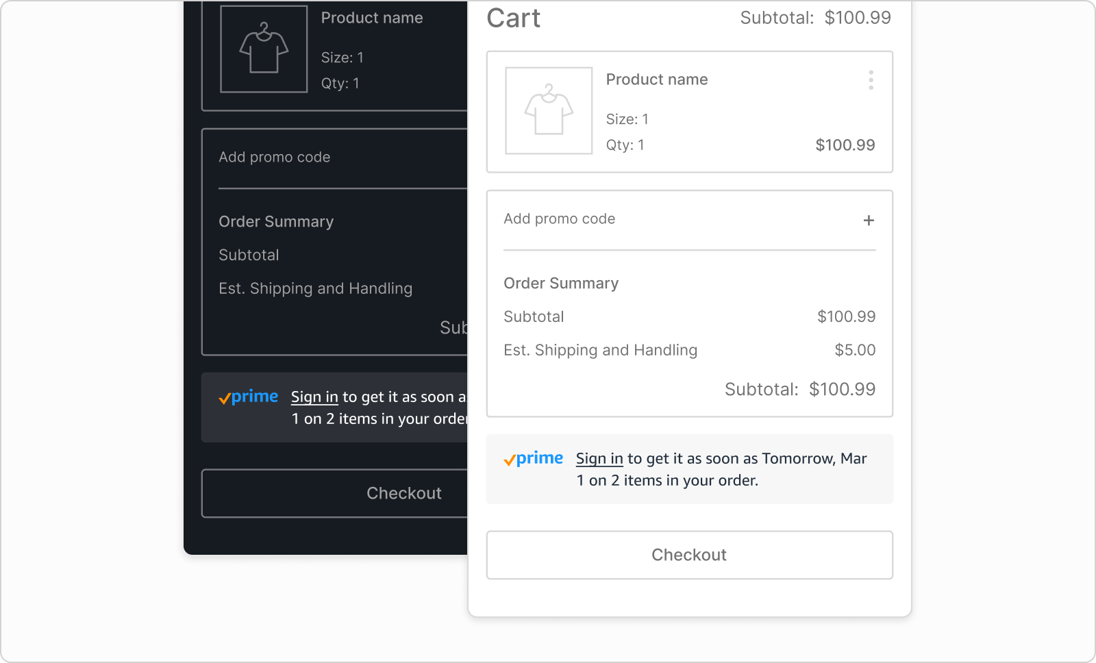
The sign-in card element is a web component that displays a sign-in option, the Prime checkmark logo, and delivery estimates based on whether the shopper is a Prime member. By default, the sign-in card element automatically handles the sign-in process redirection flow. Authentication remains valid for one hour. After one hour expires, the shopper must sign in again. Use the sign-in card element on the cart and checkout page to let the shopper sign in to their Amazon account, provide a delivery estimate, and streamline the checkout experience.
- JavaScript source:
https://cdn.elements.amazon/elements/amazon-sign-in/v1.0/web-component.js. - HTML tag:
<amazon-sign-in>.
The following image shows a sign-in card element.
Prerequisites
In addition to the general prerequisites for all elements, to use the sign-in card element, your organization must have the following prerequisites:
- The sign-in card element uses Login with Amazon (LWA). For details, see Use Login with Amazon for Shopper Identity.
- The sign-in card element uses the delivery message element to display cart-level Prime delivery estimates for Prime-eligible items. For details, see Delivery Message Element.
Attributes on the element tag
The sign-in card element has optional attributes for display settings.
Appearance
| Attribute | Value | Description | Example |
|---|---|---|---|
color-mode |
"light""dark" |
The color mode of the element. The default is "light". |
"light" "dark" |
background-color |
Hex color code | The background color of the element. | "#FFDAF0"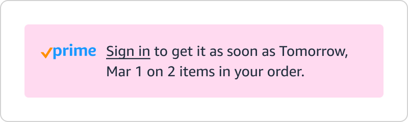 |
text-color |
Hex color code | The text color of the element. | "#BD1A83"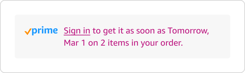 |
font-family |
Name of the font | The font of the element. The default is "Amazon Ember". |
"Amazon Ember" "Times, serif" |
font-size-base |
Size in pixels, for example 14px |
The font size of the element. The Prime Check logo increases or decreases in size to match. The default is 14px. |
"14px" "18px"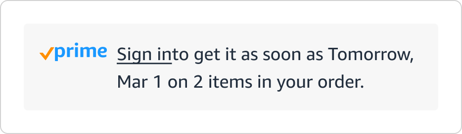 |
corner-style |
"rounded" (default)"square""pill""custom" |
The corner style of the element background. If you choose "custom", you must also set the border-radius attribute. The default is "rounded". |
"rounded" "square" "pill" |
border-radius |
Size in pixels, for example 24px |
To set a border radius, you must also set corner-style to custom. |
"24px" |
Example
<amazon-sign-in background-color="#FFDAF0" font-size-base="16">
</amazon-sign-in>